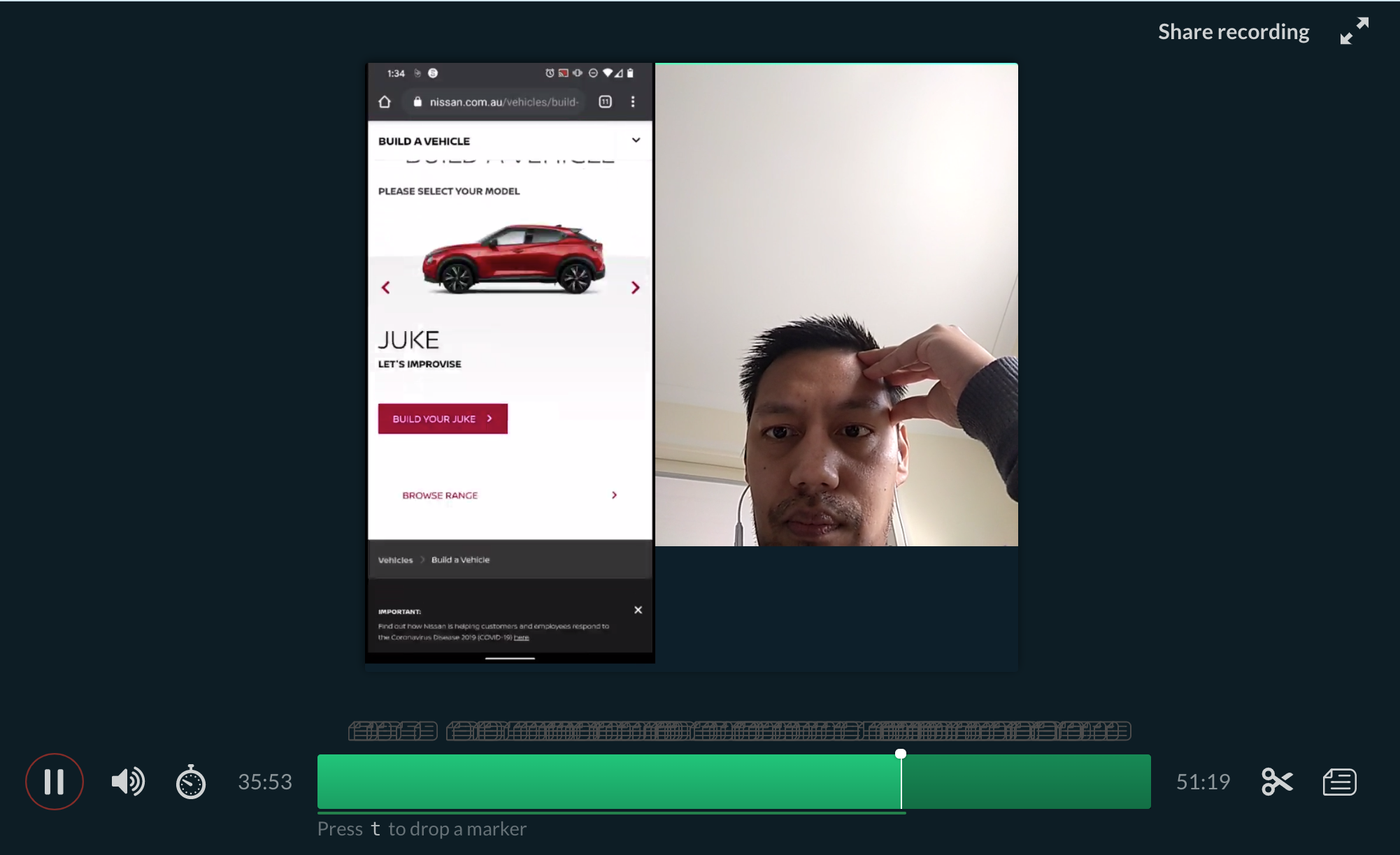
Nissan User Testing
AGENCY
AKQA, 2020
Client
Nissan
“Thanks for your help moderating user testing sessions for Nissan. The participants loved you and were instantly put at ease, the insights you uncovered were fantastic. Excellent job!”
-Natalie Fisher, Senior UX designer, AKQA
Overview
Nissan Australia engaged AKQA to test how customers were engaging with their current website. We focused on the process of how Nissan owners go about booking in for a service of their car. During testing we also looked at general navigation, how customers find help and support page, owner benefits, downloading brochures, purchasing accessories and the general customer experience. All testing was conducted remotely which came with added challenges however it was a great learning experience for me. All sessions that I facilitated were supervised by the Senior UX designer on the account.
―
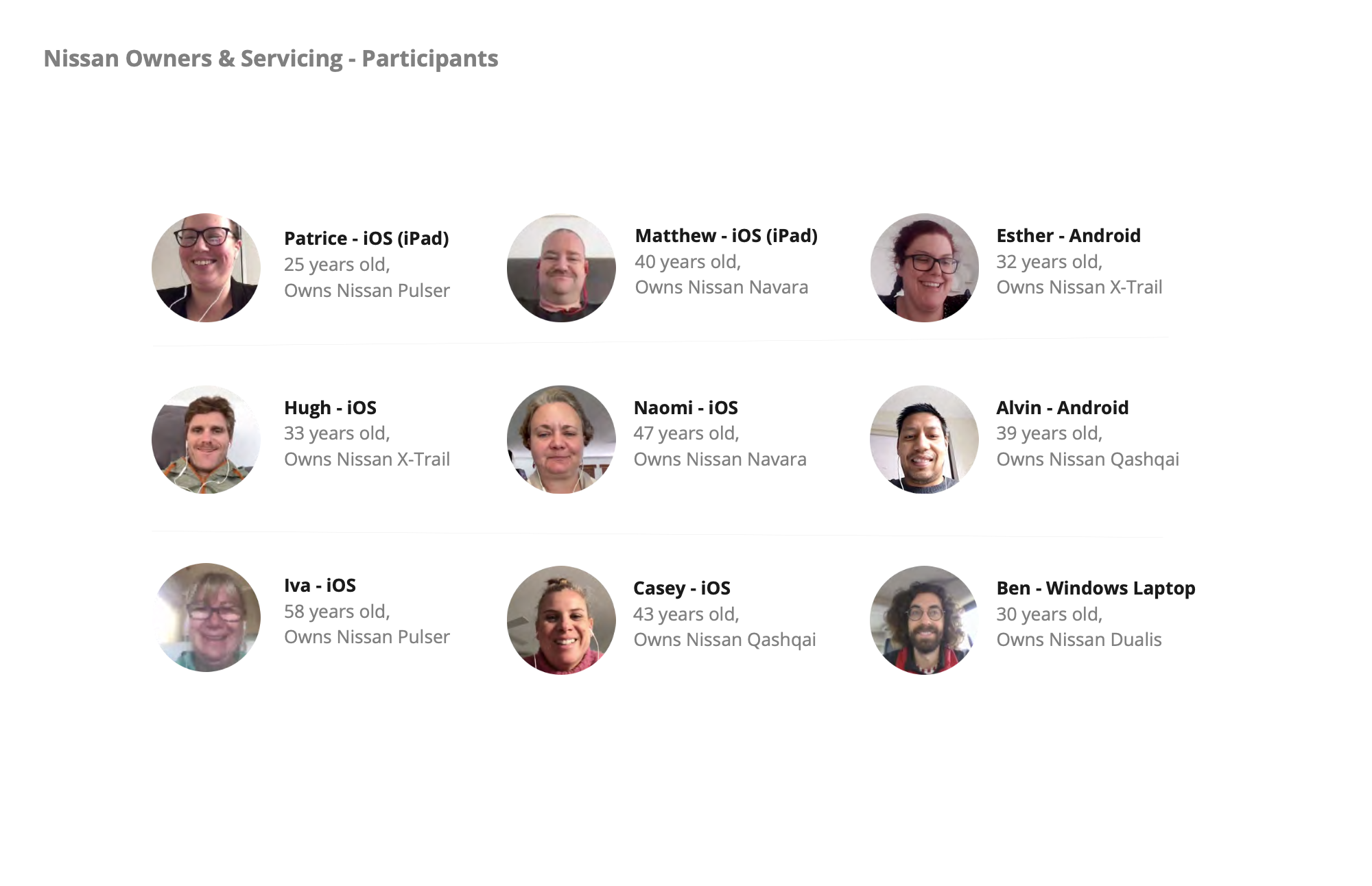
Participants for user testing
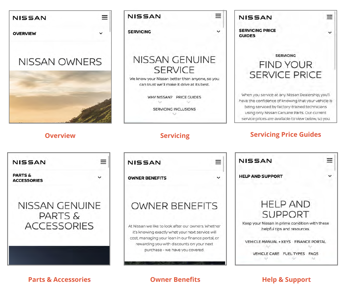
Things we know
66% of people who visit the Overview page come directly.
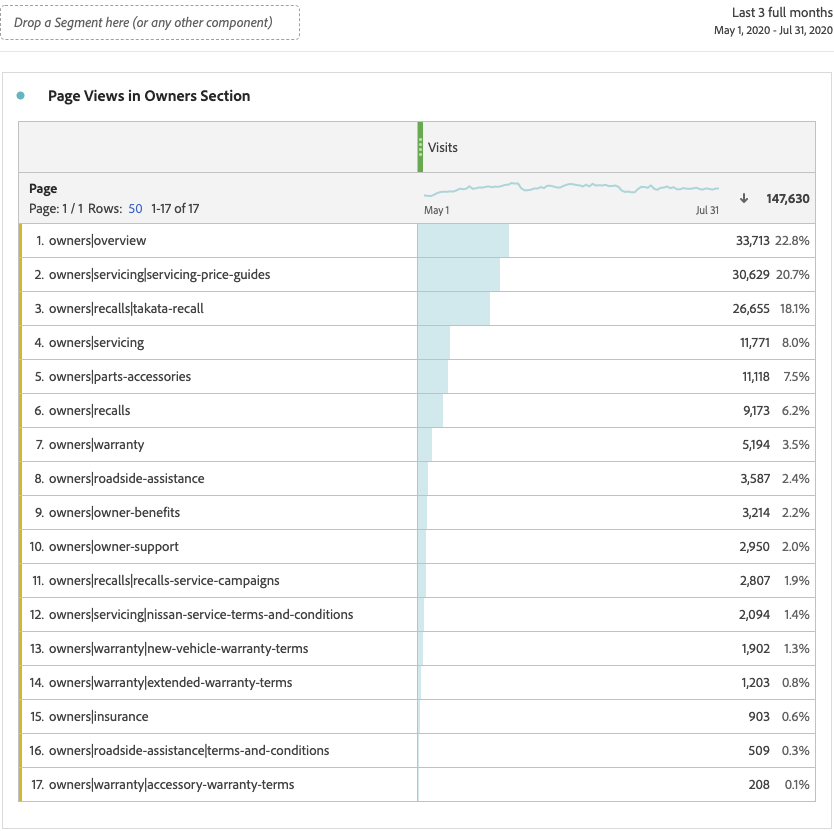
Most of the rest (~33%) come from the home page.Most visited pages are: Overview, Servicing Price Guides, Takata Recall, Recalls, Servicing & Parts & Accessories.
The least visited pages are: Accessory Warranty Terms, Roadside, Assistance Terms & Conditions, Insurance, Extended Warranty Terms.
The highest average time on site is from people who visit the Servicing Price Guides (186 seconds), Takata Recall (174 seconds), New Vehicle Warranty (161 seconds), Roadside Assistance (129 seconds), Recalls Service Campaigns (127 seconds), Owner Benefits (109 seconds).
The lowest average time on site is from people who visit the Overview page (67 seconds), Parts & Accessories (60 seconds), Recalls (45 seconds), Servicing (40 seconds)
Findings
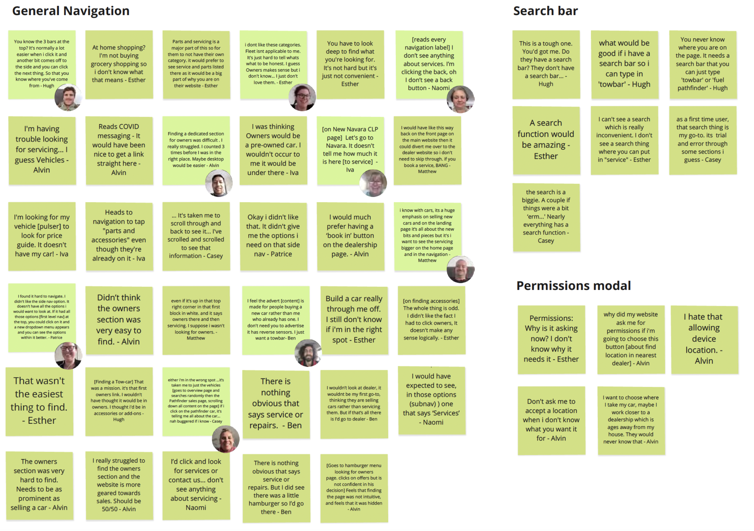
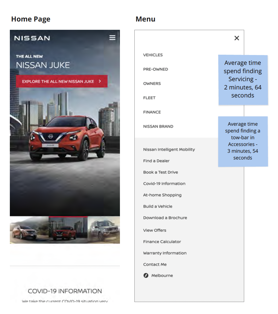
Summary - General navigation
Two main methods users looked for when navigating through the site were either navigational (Menu, Footer) or by searching. During device usability testing, navigational difficulty was consistently observed across all 9 participants.
As there is no search feature, users tried to drill down the menu structure to complete tasks but were often perplexed by the misleading category taxonomy. Due to sub- categories being hidden, users were often hesitant to proceed, struggling to infer subject significance. When users did take a leap of faith, they were often disappointed by the result or disorientated overall.
Some users needed constant assurance they were on the right page by accessing the menu and tapping on the section they were already in. This suggests that even when in the 'right place', they were lost within a sea on content and misleading CTAs. Most content across the Owners section was heavily disjointed across several sections. Users regularly got misled by "build a vehicle" CTAs or by searching for their car, which led them into the purchasing funnel, amidst much frustration.
Strategic recommendation
How might Nissan build user trust and make website information easy to access?
How might Nissan structure the website so user goals are met and knowledge is expanded?
How might Nissan engage with users that know exactly what they want and others who are still in an exploration phase?
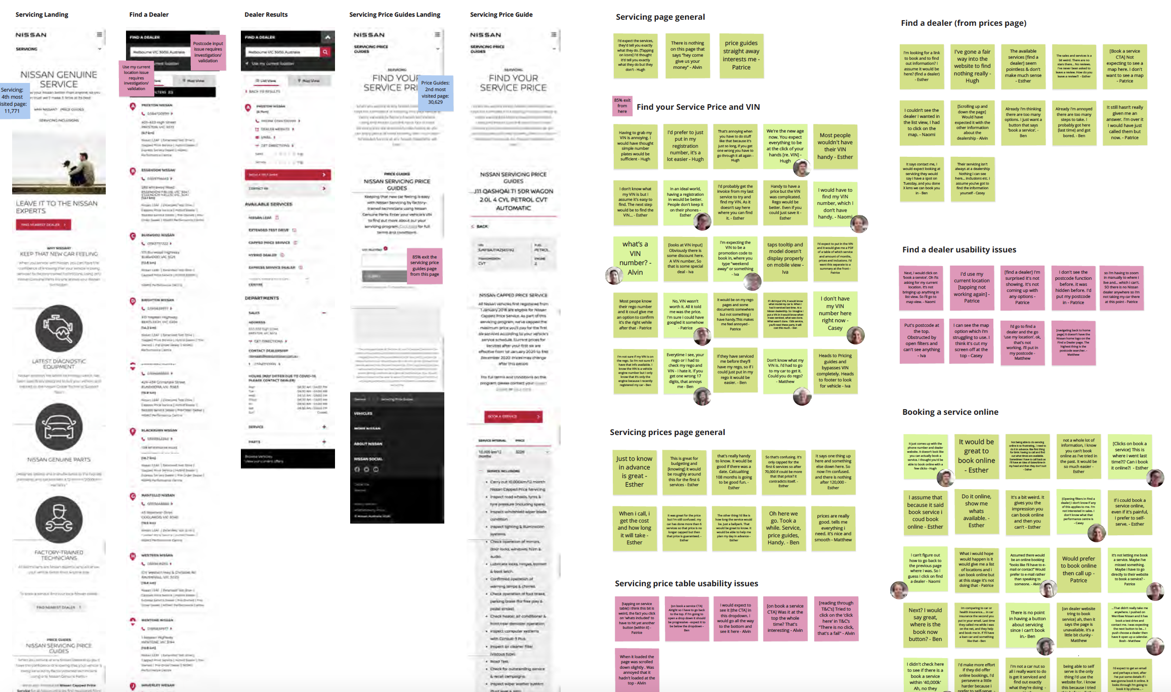
Summary - booking in a service
Once within the pricing guide specific to their car, most participants were pleased they could access ballpark figures, helping them to budget and understand inclusions.
Some users did expect more, assuming the details would be more unique to them; e.g any extra parts required or being automatically nudged into a service that aligns with their car's current kilometres. Users were generally overwhelmed by the amount of content on the page, particularly Capped Pricing content. They didn't know whether this applied to them and so were unsure as to why the information was there in the first place.
Finding the 'Book a service' CTA was difficult to find for some; there was an expectation that the CTA would be within the dropdown or at least at the bottom of the table.
Being able to book a service online was an expectation from all 9 participants and a fundamental requirement for over half.
Users were unsure as to why they were redirected to "find a dealer" when they tapped " Booked a service". Misleading CTA's confused users and they spent a large amount of time digesting other services and details on the 'Find a Dealer' page that were irrelevant to the task at hand. Disorientation and a significant amount of frustration stemmed from issues on this page too. Often, maps wouldn't load or key components of the experience were missing.
Further adding to their disappointment, the 'use my current location' feature didn't work as expected; over half the users were unable to use this effectively. Unhelpful prompts like "We can not find your location" didn't aid their frustration and others complained that the postcode input wasn't prominent, or 'cut off'.
The navigational pattern changes on 'Find a dealer'; the Nissan logo and menu hidden behind an ambiguous chevron icon. Whilst the homepage might not be an entrance path for most users, accessing home from the logo is ingrained, and it still serves as an escape route and anchor when users get a little lost, or want to reset.
Tactical recommendation
[Serving Price Guides] Content is overwhelming. Reducing the guesswork and reconsider hierarchy; removing or scaling back inapplicable content to reduce cognitive load
[Serving Price Guides] Make relevant CTAs more prominent and reconsider labelling so users aren't misled
Redesign responsively for mobile. Reposition iconography and content blocks to free up screen real estate
[Find a Dealer] Investigate 'Find my Location' issue and postcode input visibility issues
[Find a Dealer] Retain navigational pattern across whole site. Remove chevron and show menu and logo on page load.
[Find a Dealer] Consider appropriate feedback and useful prompts so users are educated and nudged to complete their searching goals i.e "Enter your
postcode above to find your nearest dealer" (Especially if location permissions was disabled earlier in the journey)
Strategic recommendation
How might Nissan facilitate end to end website self-service?
How might Nissan showcase a personalised experience across owners and servicing?
Overarching summary & recommendations
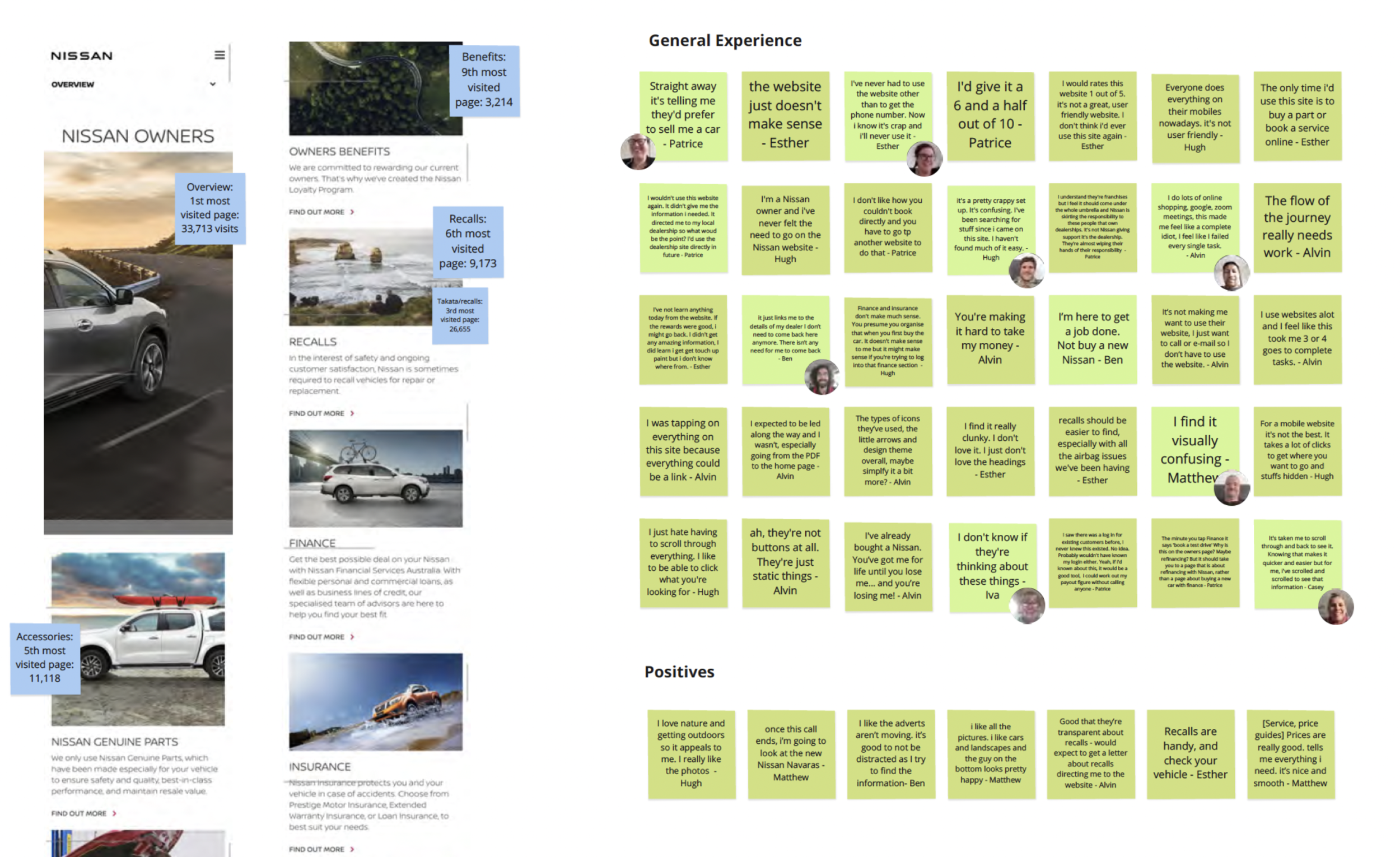
The owners section points users back into the purchasing funnel at every turn, often for no apparent reason. Remove confusing CTAs and allow users to fully self service online; whether that's buying car accessories, booking a service online or obtaining help and advice.
Owners content is overwhelming often lacks substance. Users spent a long time scanning it order to understand, across all pages. Be conscious of repetition, fragmentation and quality of copy. Reconsider hierarchy; removing or scaling back inapplicable content to reduce cognitive load.
Users had a genuine desire to engage with content blocks to learn more. Create useful content that owners can pinpoint easily and trust. Allow for full in- depth exploration. Ensure styling aids scanability to enhance engagement.
Consider consistency between link styles and other design patterns used throughout the owners journey. Ensure you're adhering to user thought processes and mental models. Ensure that they remain consistent, so usability is high, for every page they visit.
Redesign responsively for mobile. Reposition iconography and content blocks to free up screen real estate. Deep dive into navigation and taxonomy exploration. Introduce patterns and components that aid mobile 'findability' to make it easy to achieve user goals.
Although every participant had severe problems using the site, each spoke genuinely about how much they loved their Nissan vehicle. How might Nissan foster meaningful owner relationships (past and present) in ways that transcend the car sales cycle, resulting in happy Nissan for Life partnerships?
We provided summaries, insights & recommendations for 7 different areas of the site - if you would like to view these please contact Amelia.