Click For Vic Campaign
CLIENT
Visit Victoria
AGENCY
AKQA, 2020
Role
UX/UI Designer
Overview
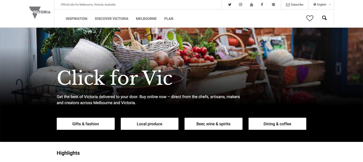
Click for Vic encourages Victorians to support the tourism industry by buying local products online. The campaign aims to connect consumers with Victorian businesses offering at-home, virtual or delivered to your door experiences and to help keep businesses operating during the pandemic. I worked on this project as a UI/UX designer with oversight from senior designers on the account. Visit Victoria engaged AKQA to make enhancements to the landing page for the ‘Click for Vic’ campaign.
The Brief
Improve the user experience via search/filtering and other enhancements.
Enabling extensibility - i.e. more listings
Surfacing more listings, and information about them for improved browsing experience, e.g. location, price, etc.
―
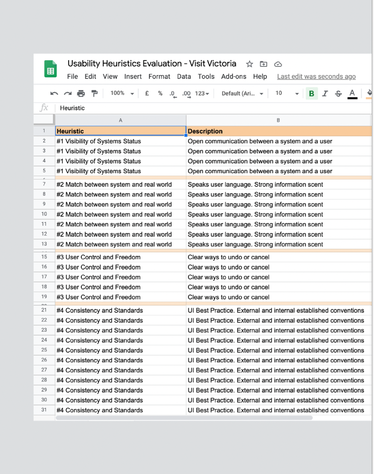
Heuristics evulation
A usability evaluation revealed insights to enhance the Click for Vic campaign as well as amplifying the user experience on the Visit Victoria website. The main issues were:
Feedback and Labelling
Navigation and Taxonomy
Accessibility
Errors and Bugs
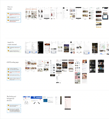
Competitor analysis
From identifying the main issues with the Click for Vic campaign, we were able to refine competitor analysis into four main areas of focus:
Filtering and results
Search
Landing Pages
Wayfinding and Navigation
Wireframes
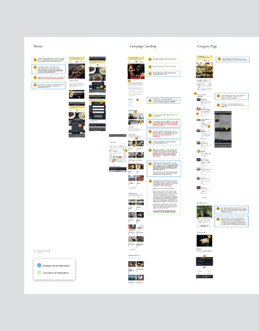
Strategic and tactical recommendations
From the heuristics evaluation, we were able to pinpoint a series of recommendations that would help inform the direction of the design stage.
Data Driven Input
Combined with the heuristics and recommendations, a layer of data-driven insight from GTM helped us to evaluate and improve existing components.
Product List View (2.8% interaction)
Carousels (7% interaction)
Location Icon (0.4% interaction)
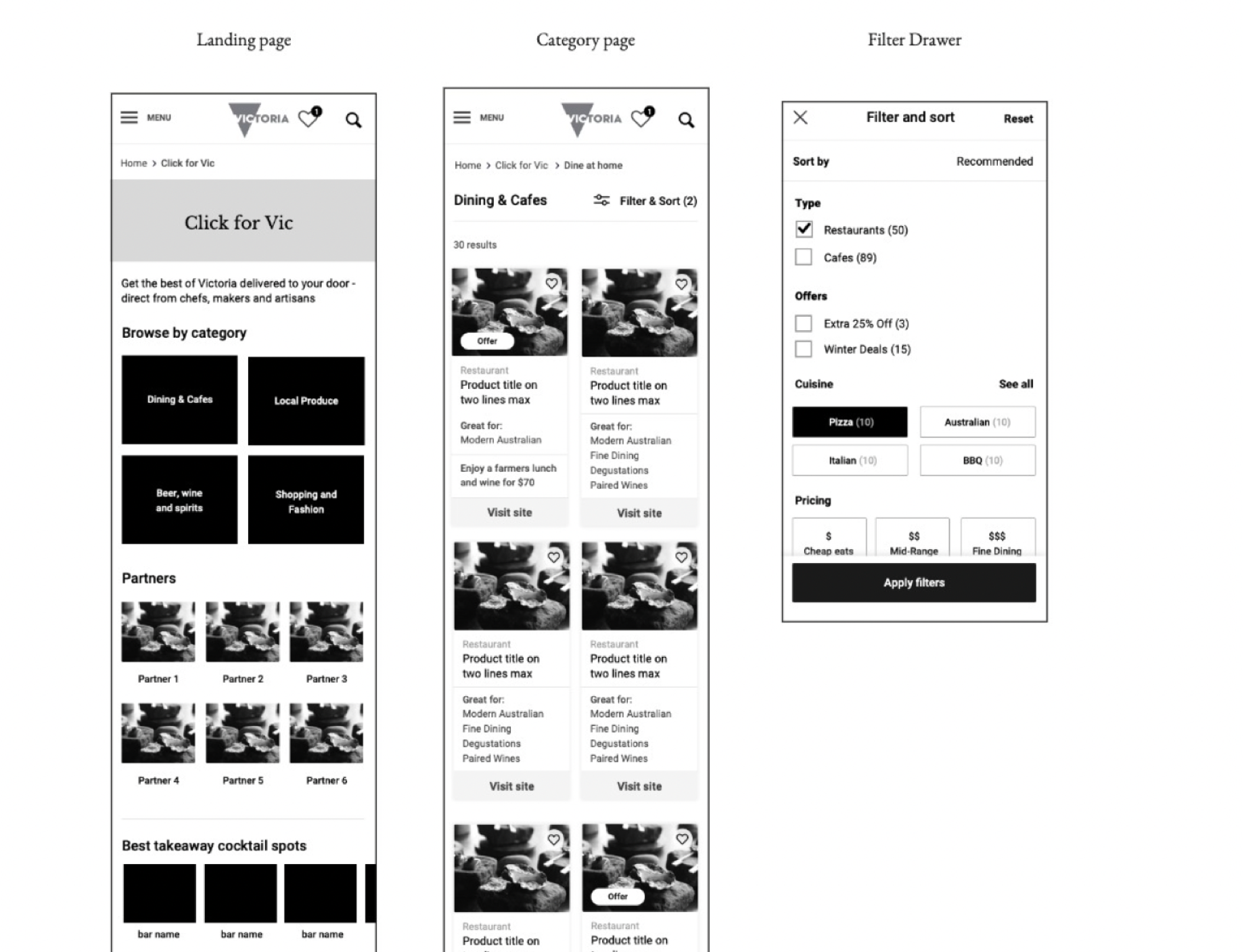
The wireframes were created by the senior UX designer on the project. The wireframes and style guide were handed over to me to begin applying the UI and getting the designs ready for development.
The Design Sprint
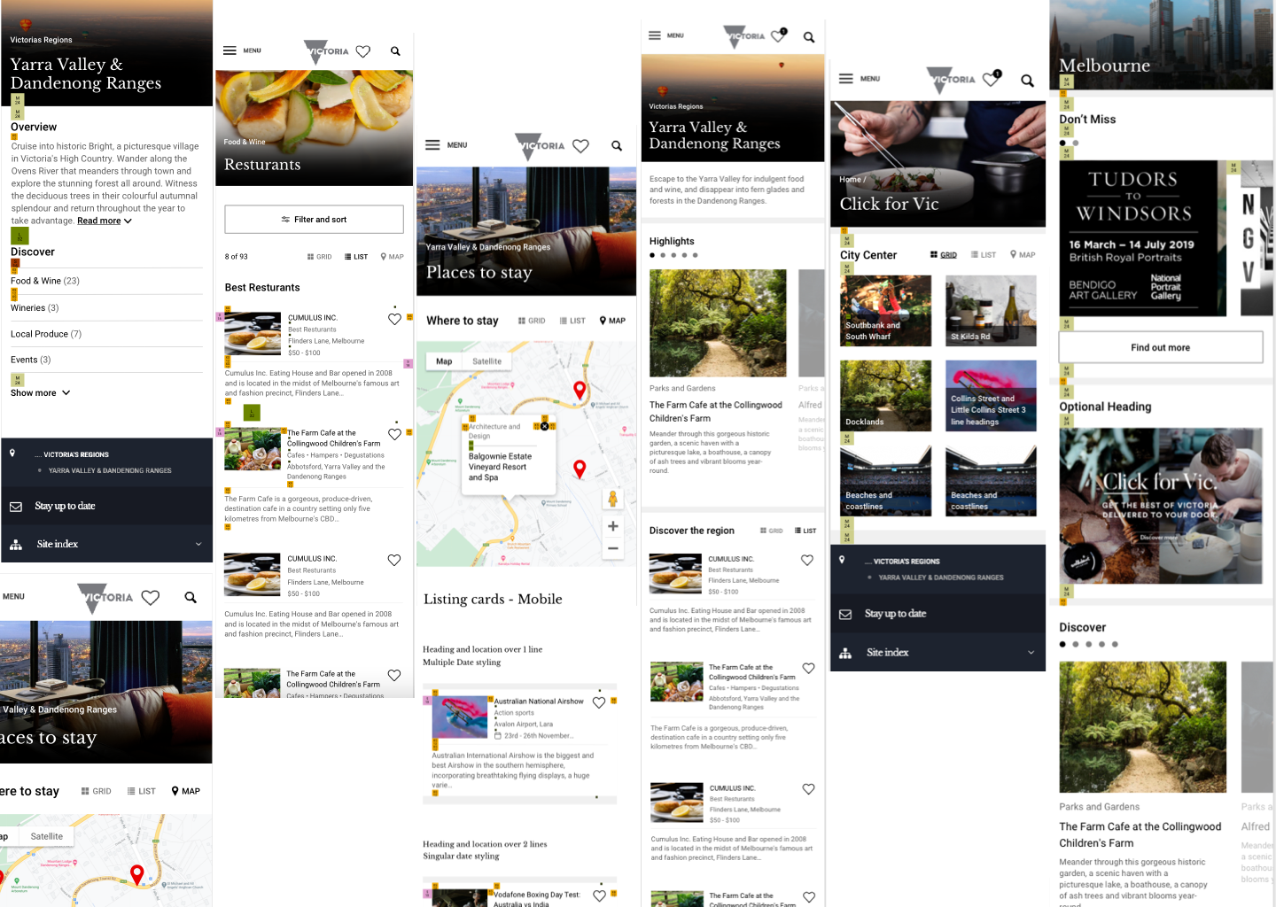
The process of rolling out the UI for the campaign was in the format of a 7-week design sprint. I was working closely with the client and senior designers, having daily check-in’s and picking up new design tickets every couple of days. Once one was completed it would go into development and we would start on a new one. This was a very fast-paced but efficient way of working. Below are some extracts from the working file in Sketch that was used for the design to developer handover.
―
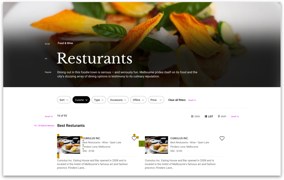
You can view the live designs here